Hey crafty friends! 👋
Welcome to Week 3 of Ink, Stamp & Repeat—where we keep it inky, pretty, and full of crafty fun!
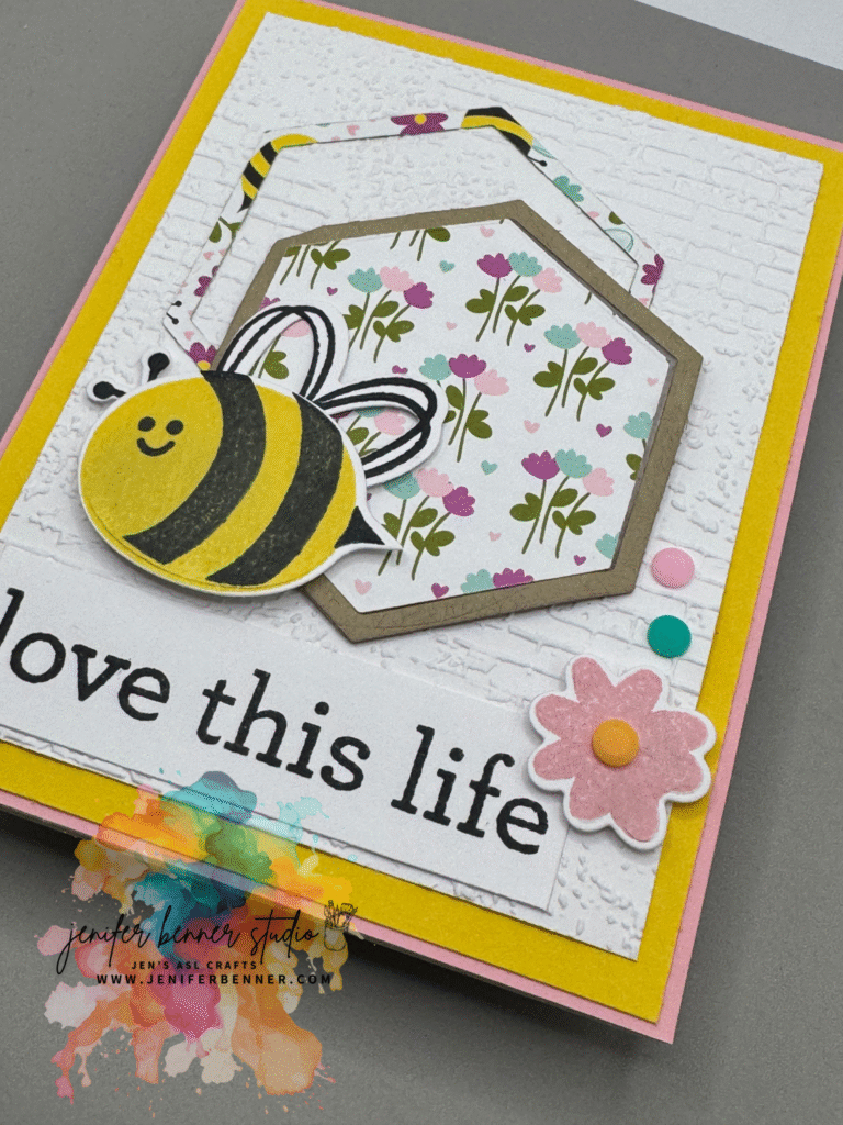
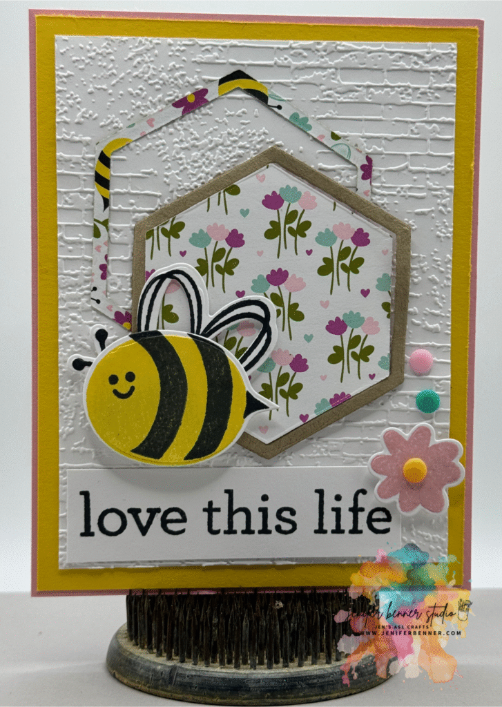
This week’s card is all about soft elegance with a sweet, buzzing vibe. I paired the Meant to Bee Designer Series Paper with a delicate pastel palette and lots of subtle texture for a card that’s as sweet as springtime. Let’s break it down!
🖌️ This Week’s Color Combo:
- Pretty in Pink
- Daffodil Delight
- White
- Crumb Cake
🐝 Key Products Featured:
- Meant to Bee Designer Series Paper – perfect for those honeycomb prints and sweet bee accents
- 2024–2026 In Color Resin Dots – I used the softer tones to add pops of interest
- Exposed Brick 3D Embossing Folder – adds texture and a hint of rustic charm to balance the sweetness
- Cardstock in coordinating colors (Pretty in Pink, White, Crumb Cake)
🎥 Watch the Tutorial on YouTube
Want to see exactly how it comes together?
🛎️ Hop over to my YouTube channel and watch the full tutorial video for this project! I walk you through each step, share tips on layering, and show you how to add those final touches that make this card buzz with charm. Don’t forget to subscribe while you’re there so you don’t miss future episodes of Ink, Stamp & Repeat!
This sweet project is perfect for birthdays, thank-yous, or just buzzing by to say hello. 🐝
Thanks for stopping by for Week 3 of Ink, Stamp & Repeat. I hope you’re enjoying these projects as much as I am creating them! Let me know in the comments—are you a bee-lover like me? 💬
See you next week for another creative twist!
💛 Jen